Everyone wants conversions on their eCommerce site.
But, are these people willing to put in the required effort?
In this post we are going to talk about the 4 pages your eCommerce site needs to optimise for higher conversions, get more people talking about your brand and elevate its branding. So here we go.
The Homepage
The homepage is nothing short of a landing page. It’s the first page a visitor is most likely to see on your site. To make an impact the homepage should be formatted in the correct way. Keep the design minimalistic, with the only graphic being the hero image.
The simple design allows the page to be navigable, which is important as it’s the first step a visitor will take to convert.
Keep the header free of too many links. The homepage offers visitors two main options: to find a specific product or to learn about a brand. Visitors can either find the product or they can learn about the brand. Your branding is the first thing visitors will see when they arrive on the page.
This is a great example of how you can provide the right information to visitors at the right spot.
The homepage also features a “Find” or Search button for people to search and get products.
Product Page
The product page is the next thing visitors will see, and it’s the one that usually gets the most attention. Visitors will usually find the product somewhere on the page ideally above the fold. They’ll see it at the very top of the page.
Depending on where people are in your funnel, Nigel, the CEO of SurveyAnyplace says that, “The next step is to create or optimize content that ranks well for these keywords and moves customers closer to a purchase.” Plus it’s also an avenue to display related products.
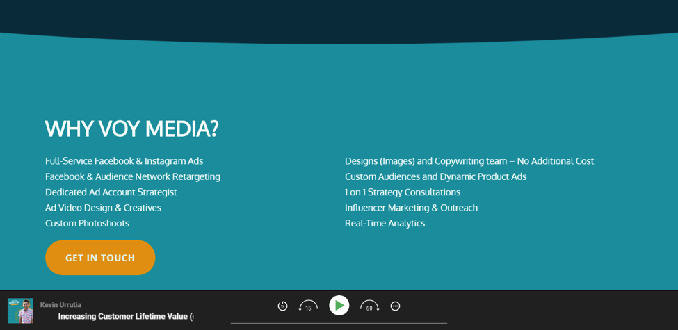
Together with information on how much the product costs. It’s also a good example of how you can answer the questions of visitors in an entirely new way without committing to a lengthy, formal product description. Also use videos on the product page. Take a look at one of the agency pages on Voymedia.

Voy Media
The page describes and gives a powerful reason for people to pick Voymedia over others.
The About Us Page
The About Us page for an online retailer must feature more information about you. It must be well-designed. The page is focused on the About Us story. It should very clearly explain the benefits and mission of the company.
The About Us story also includes a link to a FAQ, which leads visitors to additional information.It should display interesting information in a captivating way – about the brand, its history and its current product offerings
Loyalty Center
The loyalty center page is another retailer page that must sport a strong, robust-looking design. The loyalty center or the referral page talks all about the incentives you offer to people who choose to refer your business to others.
On this page you can even sport informative videos that teach about this process. Some of the videos will be short, others long but they’re worth the time, as they walk readers step-by-step through the entire process. Loyalty building requires a drip-feed email series with a good email service provider.
The tutorial also gives them a good reason to talk about you on social media. The bottom line here is that using video to explain your product is a great way to enhance your conversion rate, and an important way to get the brand in front of an audience that has the desire to learn more about the product its features and the benefits of recommendations.
This potentially leads to multiple purchases down the road. The tutorial video about a referral program is a great way to get the word out and shared with the audience.“Video” provides so much information and therefore is widely used. The video helps you as a brand stand out from the competition.
Concluding thoughts
As eCommerce marketers these are some of the most important pages to sport on your site. For some reason, a lot of eCommerce stores tend to shy away from using videos as part of product promotion.
This is mainly because they don’t know how to justify using video to sell. It’s more of a sign of laziness and not understanding the psychology of people. What do you think?
George blogs at Kamayo.in a site he started to share his journey online.
