Email newsletters are an important part of every business digital marketing mix. We’ve collated five great email newsletter design examples for you to steal, I mean borrow, some inspiration from.
No matter what email newsletter software (I recommend Mailerlite) you use these examples should get your creative juices running.
Why Mailerlite?
I have previously used many different email marketing software tools, such as Campaign Monitor, Mailchimp, Activecampaign and 1email, and none of them come even close to Mailerlite as far as their proactive support (I get a response within an hour or two), the features they include even on the free plan (landing page with custom domain, sign up pop up forms, etc) and their overall cost (cheaper than Mailchimp, go have a look at their prices!).
PLUS, as a bonus, we have $20 worth of credit for new Mailerlite customers. All you need to do, is sign up on this special link.
Looking for some inspiration with email newsletter design examples? We have collated five worth checking out, and provide some email marketing advice too!
Event email
To kick off my email newsletter design examples, is this fun email from the Free Association, promoting an upcoming event (improv classes). The super fun image, with typography that’s angular, really gives this email pride of place in my top five emails post.
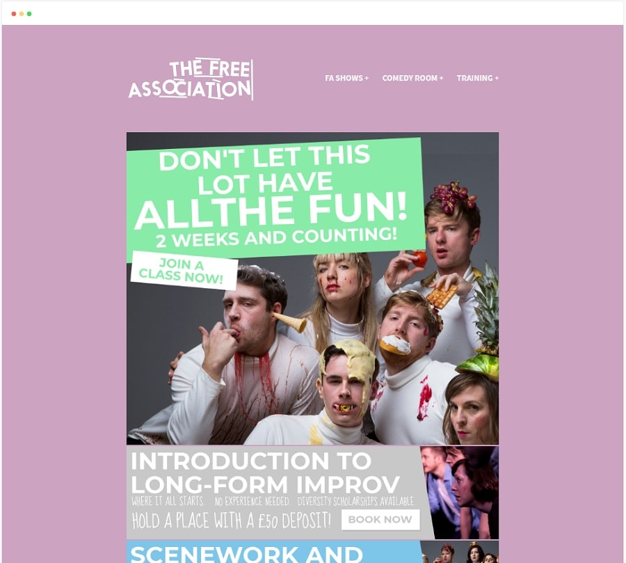
Email from The Free Association
Product focus email
This email takes the whole product first approach to a new level. I mean let’s face it, who cares about your business logo or even business name, when you first open an e-commerce mailer like this one? Once you have seen the covers and products, then show me the business name and contact details.
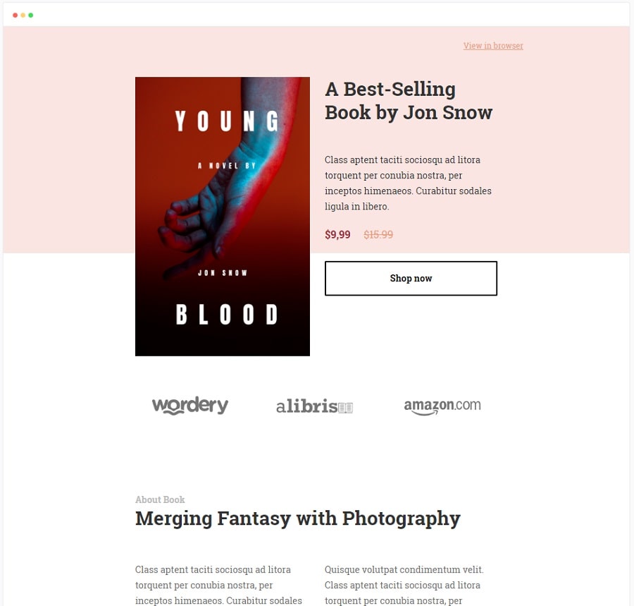
Product focus email design
Fashion e-commerce email
I believe it’s the subtle greyscale background that gets my attention with this email newsletter. The simple menu directly under the logo helps draw your attention down, and provides very easy clickable regions for readers.
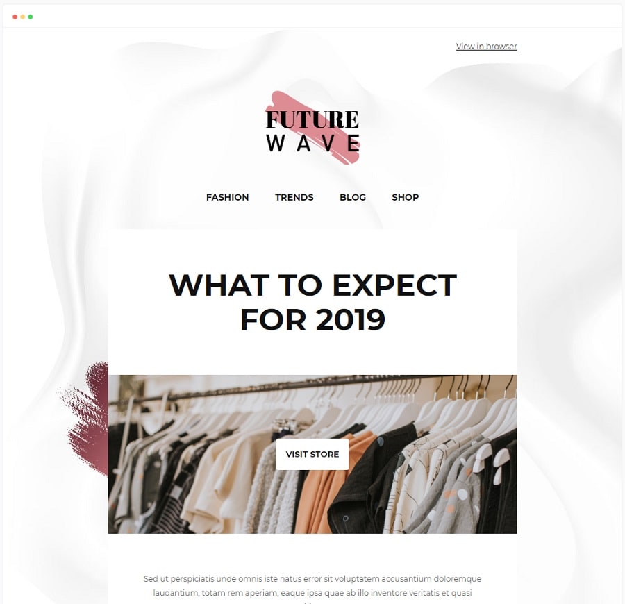
E-commerce email design
Festive season email
I love the duotone colour palette of this email – the blue, white and touch of red really gives this email a calm but fun look. The tree illustrations are great, and the snow flakes work too. Shame that in Australia, we never see snow at Christmas, but that’s an entirely different conversation to have.
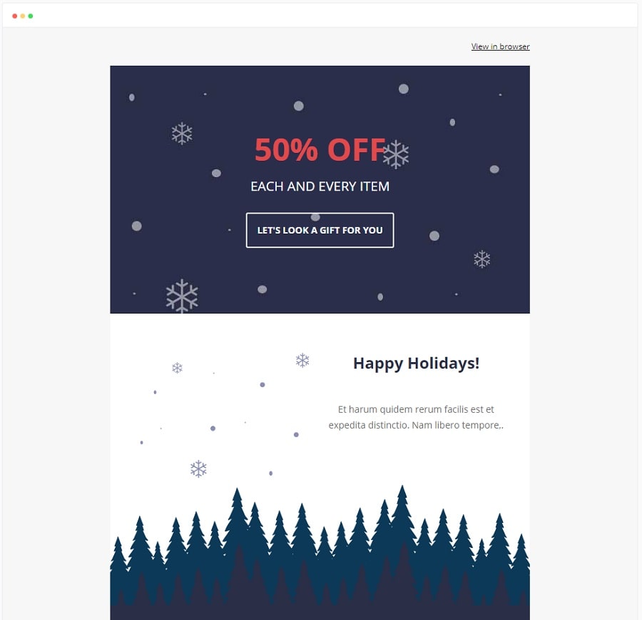
Festive season email design
Digital product email
Using a huge image showing one of your products, is always an interesting approach. What I also like about this example, is that they have used an emoji in the title, which gives the email a little personality.
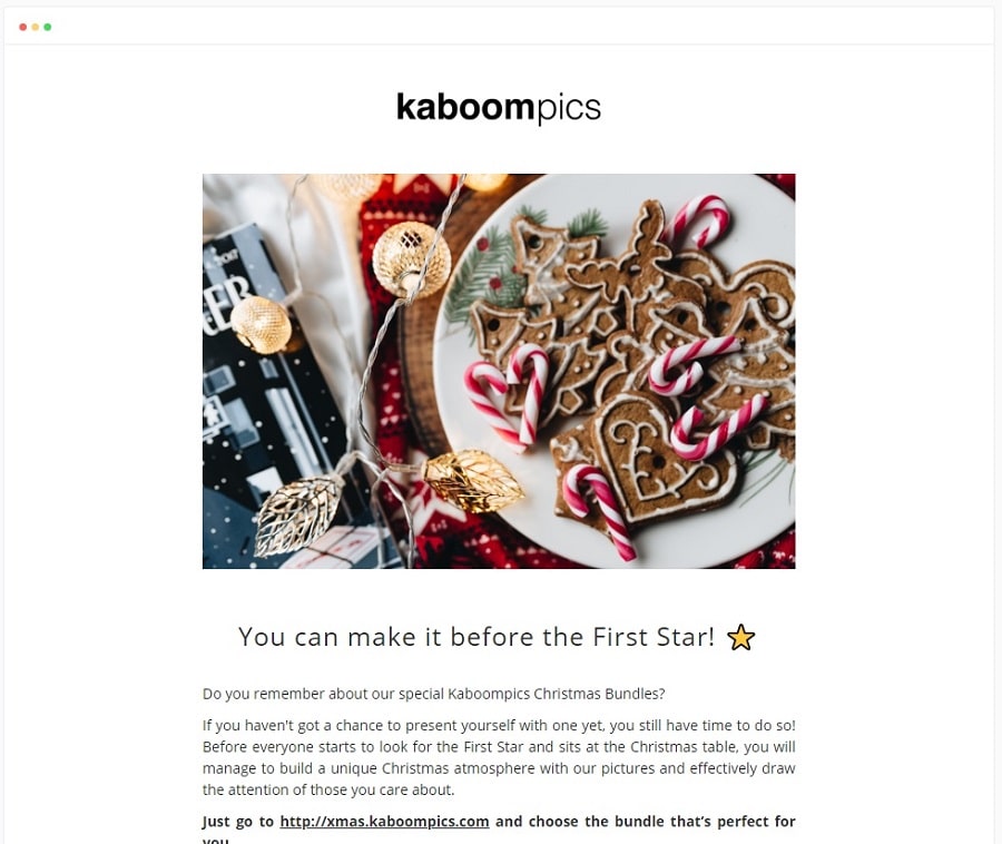
Email newsletter design example – Kaboom Pics
In Summary
We hope the above five great email newsletter design examples got you thinking about how to send out that next mailer. The festive season is nearly upon us, so now is the time to start thinking about electronic Christmas cards, new years sale emails, and more.
There are so many great examples of emails out there, you have to have some great inspiration. We know how important email marketing is, when promoting your business online, so spend a little time and effort to ensure that your email designs look fantastic and get your readers engaged with your brand.
Oh, and if you haven’t yet, sign up to Mailerlite with this $20 discount link, and have a look around. Compare their features and support to whatever platform you currently use, and I am confident you’ll make the switch!
